Introduction to the Microsoft PL-300 Exam
The Microsoft PL-300 exam, also known as the Microsoft Power BI Data Analyst Associate exam, is designed to test your skills in using Power BI to analyze data, create reports, and share insights. This certification is ideal for data analysts, business intelligence professionals, and anyone who works with data to drive decision-making. By earning this certification, you demonstrate your ability to use Power BI to its full potential, making you a valuable asset to any organization.
The exam covers a wide range of topics, including data preparation, data modeling, data visualization, and deploying and maintaining deliverables. Whether you’re a seasoned Power BI user or just starting out, the PL-300 exam is a challenging but rewarding endeavor.
Definition of Microsoft PL-300 Exam
The Microsoft PL-300 exam is a certification test that validates your expertise in using Microsoft Power BI. It assesses your ability to perform tasks such as:
- Preparing and transforming data for analysis.
- Creating and managing data models.
- Designing and building reports and dashboards.
- Sharing insights and collaborating with stakeholders.
The exam consists of 40-60 questions, which may include multiple-choice, drag-and-drop, and case study-based questions. You’ll have 120 minutes to complete the exam, and a passing score is typically around 700 out of 1000.
Understanding Power BI Reports
At the heart of Power BI is the ability to create compelling reports that tell a story with data. A Power BI report is a multi-page canvas that contains visualizations such as charts, graphs, maps, and tables. These visualizations are created using datasets, which are collections of data that have been imported or connected to Power BI.
Key Components of a Power BI Report
- Visualizations: These are the building blocks of a report. They include bar charts, line graphs, pie charts, and more. Each visualization is designed to highlight a specific aspect of the data.
- Filters: Filters allow you to narrow down the data displayed in a report. You can apply filters at the page level, report level, or visualization level.
- Slicers: Slicers are interactive filters that let users explore data dynamically. For example, a slicer could allow users to view sales data for a specific region or time period.
- Drill-Throughs: This feature enables users to navigate from a summary view to a detailed view of the data. For instance, clicking on a country in a map visualization could reveal sales data for individual cities within that country.
- Tooltips: Tooltips provide additional context when users hover over a visualization. They can display detailed information or insights that aren’t immediately visible.
Power BI Report Examples
To better understand how Power BI reports work, let’s look at a few examples:
Example 1: Sales Performance Dashboard
This report tracks sales performance across different regions and time periods. It includes visualizations such as:
- A bar chart showing monthly sales by region.
- A pie chart displaying the percentage of sales by product category.
- A map visualization highlighting high-performing regions.
Example 2: Customer Satisfaction Report
This report analyzes customer feedback data. It includes:
- A line graph showing trends in customer satisfaction over time.
- A table displaying detailed feedback comments.
- A gauge visualization indicating overall satisfaction levels.
Example 3: Financial Analysis Report
This report provides insights into an organization’s financial health. It includes:
- A waterfall chart showing revenue and expenses.
- A scatter plot comparing profit margins across product lines.
- A card visualization displaying key financial metrics such as net income.
These examples illustrate the versatility of Power BI in creating reports that cater to different business needs.
Tips for Creating Effective Power BI Reports
Creating a Power BI report is more than just dragging and dropping visualizations onto a canvas. To create reports that are both informative and engaging, consider the following tips:
- Understand Your Audience: Tailor your report to the needs of your audience. Executives may prefer high-level summaries, while analysts may require detailed data.
- Keep It Simple: Avoid cluttering your report with too many visualizations. Focus on the key insights you want to convey.
- Use Consistent Formatting: Ensure that your report has a consistent color scheme, font style, and layout. This makes it easier for users to navigate and interpret the data.
- Leverage Interactivity: Use features like slicers, drill-throughs, and tooltips to make your report more interactive and user-friendly.
- Test Your Report: Before sharing your report, test it with a small group of users to ensure that it meets their needs and is free of errors.
Tips for Passing the PL-300 Exam
Preparing for the PL-300 exam requires a combination of hands-on experience and strategic study. Here are some tips to help you succeed:
- Get Hands-On Experience: The best way to prepare for the exam is by using Power BI regularly. Practice creating reports, building data models, and analyzing data.
- Review the Exam Objectives: Microsoft provides a detailed list of topics covered in the exam. Make sure you’re familiar with each one.
- Take Practice Tests: Practice tests are a great way to assess your knowledge and identify areas where you need improvement. DumpsBoss offers high-quality practice questions that mimic the actual exam.
- Join a Study Group: Studying with others can help you stay motivated and gain new insights. Look for online forums or local study groups focused on the PL-300 exam.
- Use Reliable Study Materials: DumpsBoss provides comprehensive study materials, including dumps, guides, and video tutorials, to help you prepare for the exam.
- Manage Your Time: During the exam, keep an eye on the clock. Don’t spend too much time on any one question. If you’re unsure of an answer, mark it for review and move on.
Conclusion
The Microsoft PL-300 exam is a valuable certification for anyone looking to demonstrate their expertise in Power BI. By understanding the key concepts of Power BI reports, practicing your skills, and using reliable resources like DumpsBoss, you can increase your chances of passing the exam and advancing your career.
Power BI is more than just a tool—it’s a gateway to unlocking the power of data. Whether you’re analyzing sales performance, tracking customer satisfaction, or monitoring financial health, Power BI empowers you to make data-driven decisions with confidence. So, take the first step toward becoming a Microsoft Certified: Power BI Data Analyst Associate today. With dedication, practice, and the right resources, you’ll be well on your way to success.
Special Discount: Offer Valid For Limited Time “PL-300 Exam” Order Now!
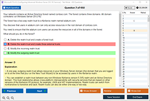
Sample Questions for Microsoft PL-300 Dumps
Actual exam question from Microsoft PL-300 Exam.
Which of the following is an example of a Power BI report?
A) A spreadsheet with raw data
B) A dashboard visualizing sales performance with interactive charts and filters
C) A written document summarizing quarterly results
D) A PowerPoint presentation with static images